Wellness-Driven Interior Design: How to Create a Home That Actually Supports Your Wellbeing

Wellness used to live somewhere else. At the yoga studio, the day spa, the gym. Somewhere you drove to, paid for, and left behind when you walked back through your own front door. But something has shifted in the way we think about our homes, and it’s one of the most meaningful interior trends I’ve seen in years. Increasingly, women are bringing wellness into the home itself, creating spaces that don’t just look beautiful but actively support how we feel.
And the good news is that you don’t need a dedicated room, a substantial renovation budget, or an interior designer on speed dial to make it happen. You just need to start thinking about your home a little differently.
Why the Home Has Become Our Wellness Sanctuary
The past few years have fundamentally changed our relationship with our living spaces. We’ve asked more of our homes than ever before, and in doing so we’ve realised how profoundly our environment affects our mental and emotional state. The colours on our walls, the quality of light in a room, the materials we surround ourselves with — all of it shapes how we feel, often in ways we don’t consciously register until something changes.
Interior Designer and Stylist Kerrie-Ann Jones, who recently partnered with Dulux to create her own at-home wellness studio, puts it beautifully. “Whether it’s used for exercise, meditation, or simply unwinding at the end of the day, having a space in your own home that’s intentionally designed for wellbeing can have a meaningful impact on both mental and emotional health.” A dedicated wellness space may feel like a luxury, but as Kerrie-Ann points out, even a thoughtfully styled corner of a room can become somewhere you return to deliberately, rather than simply pass through.
The Role Colour Plays
If you’re thinking about creating a more wellness-focused space in your home, colour is the most powerful and most accessible place to start. Paint is one of the most affordable ways to completely transform how a room feels, and the shift in Australian interiors right now is moving decisively away from stark whites and toward warmer, more grounding neutrals that wrap a space in softness rather than clinical brightness.
Kerrie-Ann is a passionate advocate for Dulux’s Most Loved collection of neutrals, and it’s easy to see why. “Warm neutrals work beautifully in our climate because they create softness while still feeling fresh and contemporary,” she explains, “making them ideal colour choices for creating a dedicated area for mindful activities and hobbies in the home.”
For her own wellness studio, Kerrie-Ann chose Dulux Vintage Beige for the walls (I actually used this colour on the weatherboards of our house, offset with Dulux Monument on the render and trim), a soft, warm mid-tone with gentle ochre hints that feels grounding without ever being heavy. The doors and skirting boards were painted in Dulux Natural White, creating a subtle, timeless contrast that lifts the space without disrupting its calm. The result is a room that feels immediately inviting, a world away from the cold, functional aesthetic of a typical home gym.
It’s worth noting that neutrals have evolved considerably beyond white, beige, and grey. “We’re seeing soft sage greens, earthy pinks, terracotta tones, warm browns and even sky blues becoming increasingly popular,” says Kerrie-Ann, “because they bring warmth and personality while still feeling calm and timeless.” If you’ve been hesitant about colour, this expanded palette offers a beautiful middle ground between bold and bland.
One important consideration before you commit to a shade: always test samples in your actual space, at different times of day. Australian light is extraordinary and changes dramatically from morning to afternoon, and a neutral that looks warm and inviting at 10am can read completely differently by late afternoon. It’s a step that’s easy to skip and worth never skipping.

Layering Materials and Texture
Paint sets the emotional foundation of a room, but it’s what you layer on top that truly brings a wellness space to life. Natural materials are central to this — timber, linen, stone, and rattan all bring an organic warmth that synthetic materials simply can’t replicate, and they work beautifully alongside the warm neutral palette that defines this aesthetic.
In her own studio, Kerrie-Ann layered sheer curtains to diffuse light softly through the space, warm timber for grounding, sculptural forms for visual interest, and considered accent colours in burgundy and sage green for depth. A touch of chrome adds a contemporary edge without disrupting the calm. “It’s the synergy of all elements that truly transforms a room,” she explains. “Warm paint tones set the mood, while the right mix of materials infuse depth, creating a textured, lived-in feel.”
Lighting deserves particular attention in a wellness space. Harsh overhead lighting is the enemy of calm, and soft, layered lighting, including floor lamps, table lamps, and where possible, an abundance of natural light, makes an enormous difference to how a space feels at different times of the day.
You Don’t Need a Dedicated Room
This is the part I want to linger on, because I think it’s where most of us get stuck. The idea of a wellness room feels like something that belongs in a much larger home, or a different budget, or someone else’s life entirely. But the principles that make a space feel restorative apply equally to a corner of the bedroom, a reading nook, a section of the living room you’ve claimed as your own.
A comfortable chair in a well-lit corner, painted in a warm neutral that makes you exhale when you walk in. A small shelf with the books you’re working through, a plant or two, a candle. Sheer curtains that soften the light. A yoga mat that lives rolled out rather than hidden in a cupboard, because when it’s easy to use, you actually use it. These are not grand gestures. They are small, considered choices that add up to a space that supports you rather than simply containing you.

Kerrie-Ann’s Colour Picks Worth Knowing
For those ready to try a new neutral, Kerrie-Ann’s top picks from the Dulux Most Loved collection offer a beautiful starting point. Dulux Vintage Beige is the warm, versatile all-rounder, perfect for walls in any interior style and stunning alongside Dulux White Polar Quarter and Dulux Parchment Paper. Dulux Natural White is the timeless classic that pairs effortlessly with timber and stone. Dulux Oyster Linen brings a subtle green undertone that reads as quietly sophisticated on both walls and trims. Dulux Tavern is the richer, deeper option for those who want genuine warmth and drama, while Dulux Basketweave Beige is a beautiful brownish neutral that grounds a space beautifully, particularly alongside a soft blue-grey like Dulux Tinker.
For more information and to explore the full Most Loved collection, visit the Dulux website.
Where to Begin
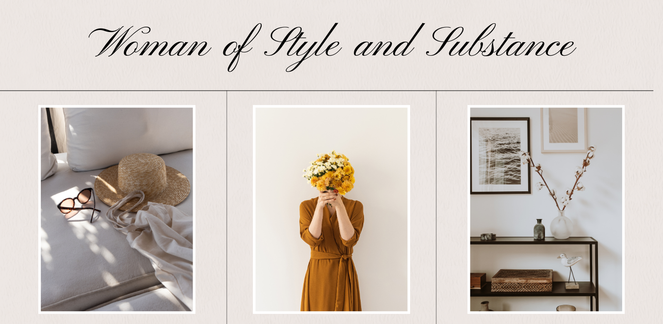
If all of this feels a little overwhelming, Kerrie-Ann’s advice is reassuringly simple: start with a mood board. Gather images that capture how you want to feel in the space, choose a paint colour that matches that mood, and build outward from there. “For wellness areas,” she adds, “use equipment that fits the style of the room for a seamless look.” Before buying anything new, try rearranging what you already have. Sometimes moving a single piece of furniture completely changes how a room feels, and it costs nothing to find out.
The home we’ve always had might be closer to the wellness sanctuary we’ve been looking for than we realised. Sometimes all it takes is seeing it differently — and a tin of the right paint.

